
L B


Zrihat Halev began with the idea of translating the healing energy of crystals into a visual form.
The first concept drew inspiration from the natural harmony of the sun and the softness of flower petals - a symbol of renewal, balance, and light
Inspiration

The early sketches featured a half-sun surrounded by sunflower-like petals, expressing warmth and growth.
This evolved into green leaf shapes - representing natural healing and connection to the earth - while maintaining the circular rhythm of energy radiating from the sun.
Exploration

As the concept matured, the green tones were removed and replaced with clear, luminous crystals to enhance the spiritual and pure aspect of the brand.
The focus shifted toward creating a radiant, balanced composition where each crystal symbolizes clarity and emotional elevation.
Refinement
Final Logo
In the final version blends the rising sun - a symbol of growth and new beginnings - with luminous crystal forms representing balance and healing.
Soft gradients and translucent details echo the natural beauty of minerals, while clean typography brings calm and clarity.
Lavender and sunrise tones were chosen to evoke spiritual restoration and emotional warmth, creating a serene identity that connects inner light with visual purity.


A natural healing brand inspired by the light of crystals -
where warmth, balance, and inner energy meet in gentle harmony.
Brand Identity ∙ Logo Design ∙ Product design


Label Design
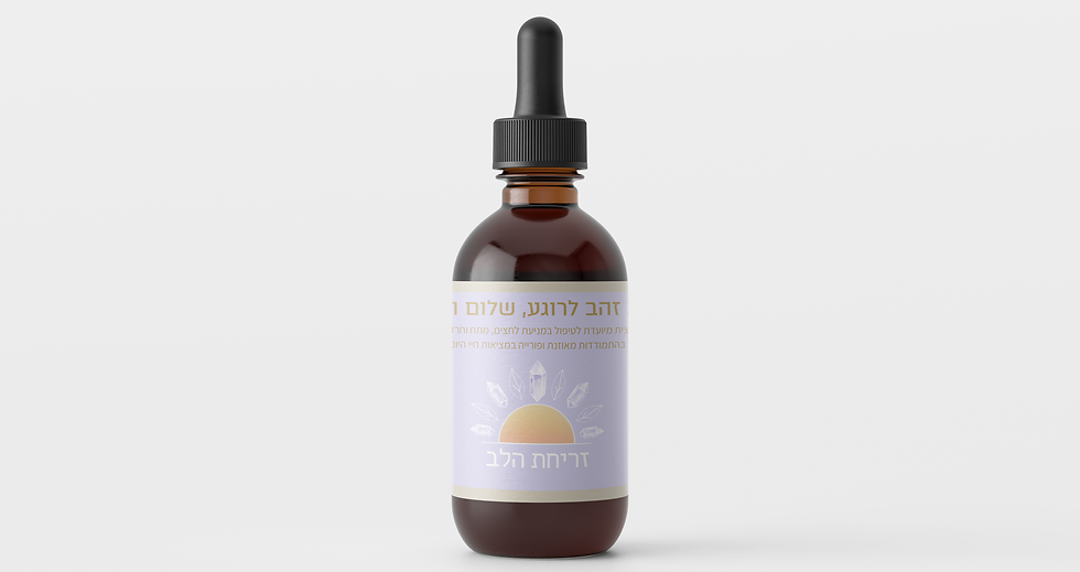
Each label in the Zrihat Halev collection was designed to reflect a different emotional and energetic state through color, light, and symbolism.
The minimalist aesthetic combines gentle gradients, crystal illustrations, and clean typography to express purity, balance, and serenity.
-
Golden Drops - Calm & Peace: soft gold tones represent inner harmony and relaxation.
-
Purple Drops - Deep Sleep: lavender hues convey tranquility and restorative rest.
-
Blue Drops - Relief & Healing: light turquoise shades symbolize clarity, flow, and pain release.
Together, the three designs create a cohesive yet distinct visual language that captures the essence of emotional healing through nature’s energy - pure, balanced, and luminous.


LOCATION
libiaviyam.com
Tel Aviv, Israel
STAY CONNECTED
© DESIGNED BY LIBI AVIYAM